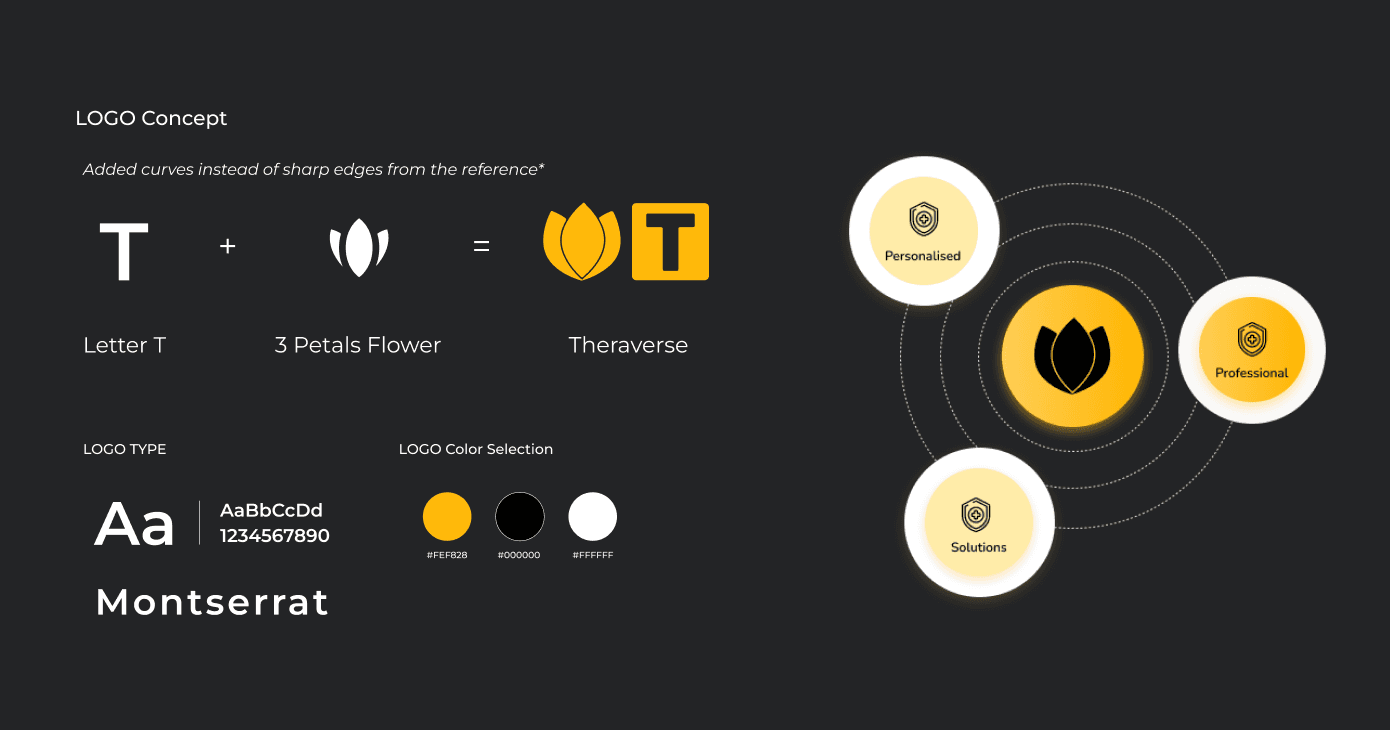
Theraverse
Theraverse
Tackling mental health challenges with empathetic design, resulting in a 40% reduction in booking barriers and 10K+ downloads within the first month.
Overview of theraverse
Overview of theraverse
Finding the right mental health support shouldn't feel overwhelming. For many, navigating the complexities of mental health care—from discovering a reliable therapist to booking a session—creates unnecessary friction. Theraverse was born to simplify this journey, empowering users to connect with therapists effortlessly while giving therapists the tools to manage their practice seamlessly.
Aim: Design a platform that bridges the gap between mental health seekers and therapists, fostering trust, ease of use, and accessibility.
Context: Mental health issues affect millions, yet the stigma and complexity of finding help leave many underserved. Theraverse seeks to normalize this process by offering a safe, approachable digital solution.
Goals:
Reduce friction in appointment booking and management.
Create trust and reliability through user-friendly features.
Serve both therapists and users equally with tailored interfaces.
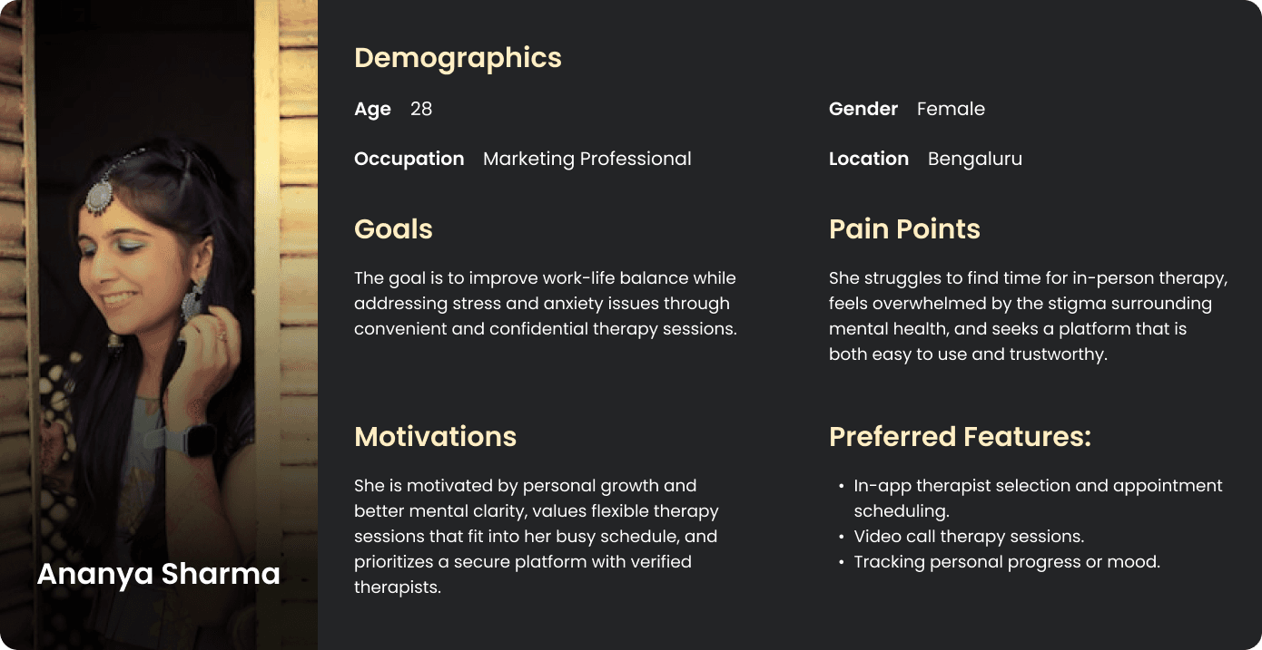
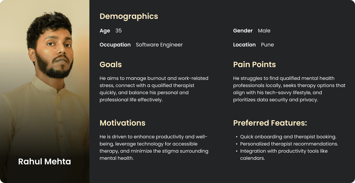
Users:
Finding the right mental health support shouldn't feel overwhelming. For many, navigating the complexities of mental health care—from discovering a reliable therapist to booking a session—creates unnecessary friction. Theraverse was born to simplify this journey, empowering users to connect with therapists effortlessly while giving therapists the tools to manage their practice seamlessly.
Aim: Design a platform that bridges the gap between mental health seekers and therapists, fostering trust, ease of use, and accessibility.
Context: Mental health issues affect millions, yet the stigma and complexity of finding help leave many underserved. Theraverse seeks to normalize this process by offering a safe, approachable digital solution.
Goals:
Reduce friction in appointment booking and management.
Create trust and reliability through user-friendly features.
Serve both therapists and users equally with tailored interfaces.
Users:
Overview of theraverse
Finding the right mental health support shouldn't feel overwhelming. For many, navigating the complexities of mental health care—from discovering a reliable therapist to booking a session—creates unnecessary friction. Theraverse was born to simplify this journey, empowering users to connect with therapists effortlessly while giving therapists the tools to manage their practice seamlessly.
Aim: Design a platform that bridges the gap between mental health seekers and therapists, fostering trust, ease of use, and accessibility.
Context: Mental health issues affect millions, yet the stigma and complexity of finding help leave many underserved. Theraverse seeks to normalize this process by offering a safe, approachable digital solution.
Goals:
Reduce friction in appointment booking and management.
Create trust and reliability through user-friendly features.
Serve both therapists and users equally with tailored interfaces.
Users:
Business Needs
Business Needs
The mental health app market is growing rapidly, yet gaps remain.
App Market Analysis:
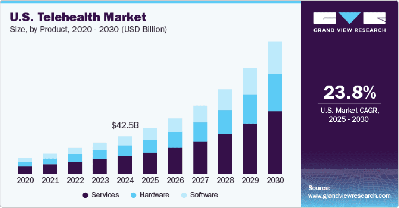
The U.S. telehealth market was valued at USD 29.6 billion in 2022 and is expected to grow at a CAGR of 22.9% from 2023 to 2030
Competitive analysis reveals key players like Teladoc and Amwell, with significant market shares.
Pain points include high patient no-show rates (estimated at around 30%) and inefficient scheduling systems.
Competitive Analysis:
Analyzed apps like BetterHelp and Talkspace:
Strengths: Brand trust, broad therapist availability.
Weaknesses: Overcomplicated onboarding and UI.
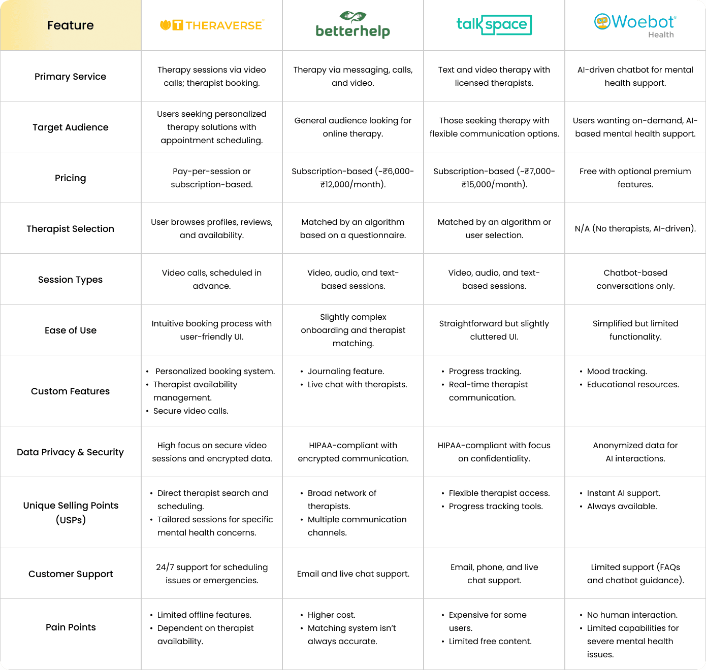
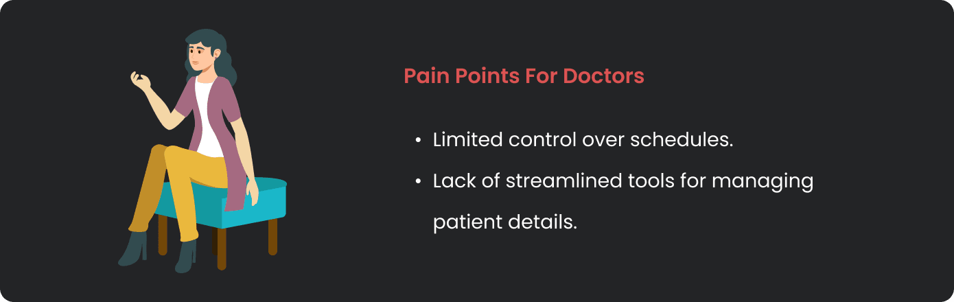
Identified Pain Points:
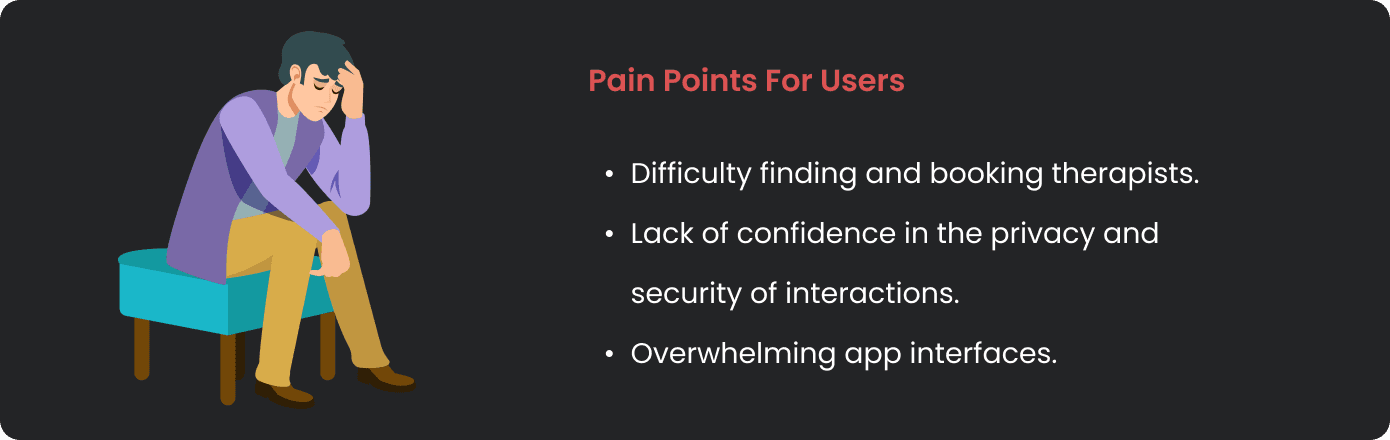
Imagine needing help but feeling lost in a maze of unhelpful forms and unclear instructions. That’s what Theraverse set out to fix.
The mental health app market is growing rapidly, yet gaps remain.
App Market Analysis:
The U.S. telehealth market was valued at USD 29.6 billion in 2022 and is expected to grow at a CAGR of 22.9% from 2023 to 2030
Competitive analysis reveals key players like Teladoc and Amwell, with significant market shares.
Pain points include high patient no-show rates (estimated at around 30%) and inefficient scheduling systems.
Competitive Analysis:
Analyzed apps like BetterHelp and Talkspace:
Strengths: Brand trust, broad therapist availability.
Weaknesses: Overcomplicated onboarding and UI.
Identified Pain Points:
Imagine needing help but feeling lost in a maze of unhelpful forms and unclear instructions. That’s what Theraverse set out to fix.
Business Needs
The mental health app market is growing rapidly, yet gaps remain.
App Market Analysis:
The U.S. telehealth market was valued at USD 29.6 billion in 2022 and is expected to grow at a CAGR of 22.9% from 2023 to 2030
Competitive analysis reveals key players like Teladoc and Amwell, with significant market shares.
Pain points include high patient no-show rates (estimated at around 30%) and inefficient scheduling systems.
Competitive Analysis:
Analyzed apps like BetterHelp and Talkspace:
Strengths: Brand trust, broad therapist availability.
Weaknesses: Overcomplicated onboarding and UI.
Identified Pain Points:
Imagine needing help but feeling lost in a maze of unhelpful forms and unclear instructions. That’s what Theraverse set out to fix.
Define
Define
Understanding the problem was only the first step. The next was structuring the solution.
Information Architecture:
Designed a logical, straightforward hierarchy for both user and therapist interactions.
User flow highlights: Easy account creation, clear therapist discovery, step-by-step booking.
Therapist flow highlights: Intuitive scheduling, appointment tracking, and earnings management.
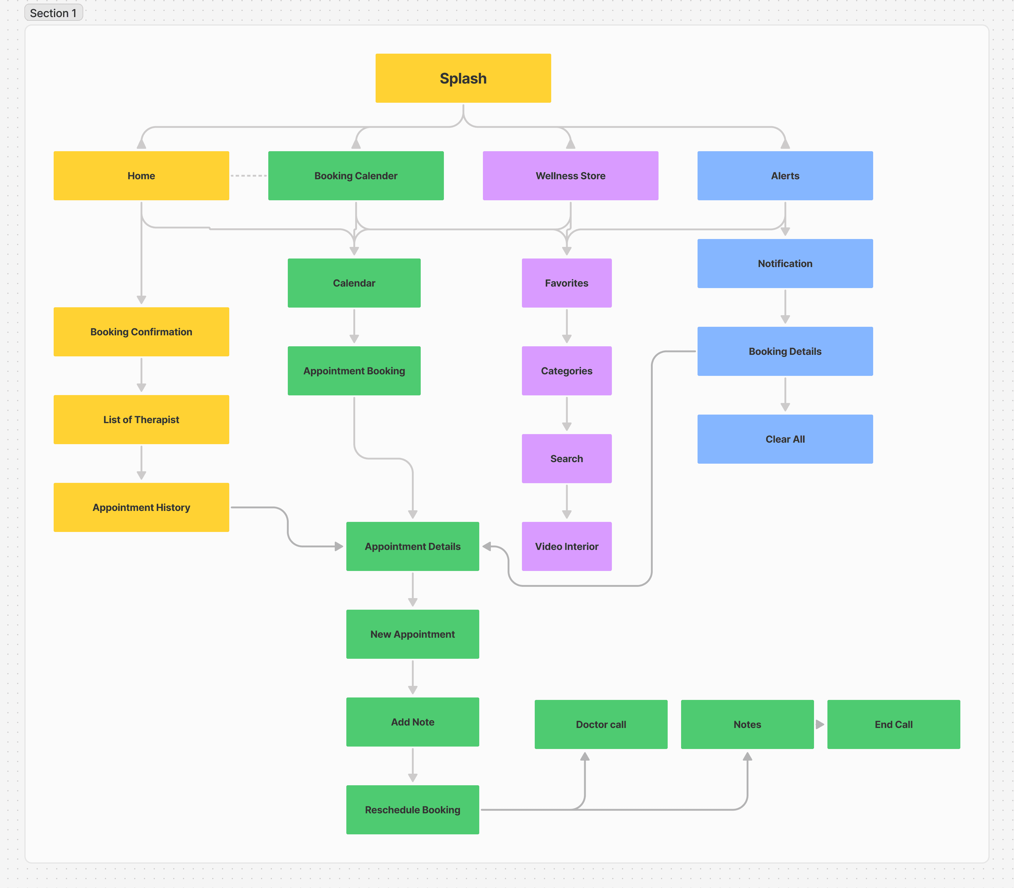
User Flow Diagrams:
Customer Flow: Account creation → Browse therapists → View therapist profiles → Book appointment → Attend session → Provide feedback.
Doctor Flow: Sign-up → Create profile → Set availability → Accept bookings → Conduct sessions → Track performance.
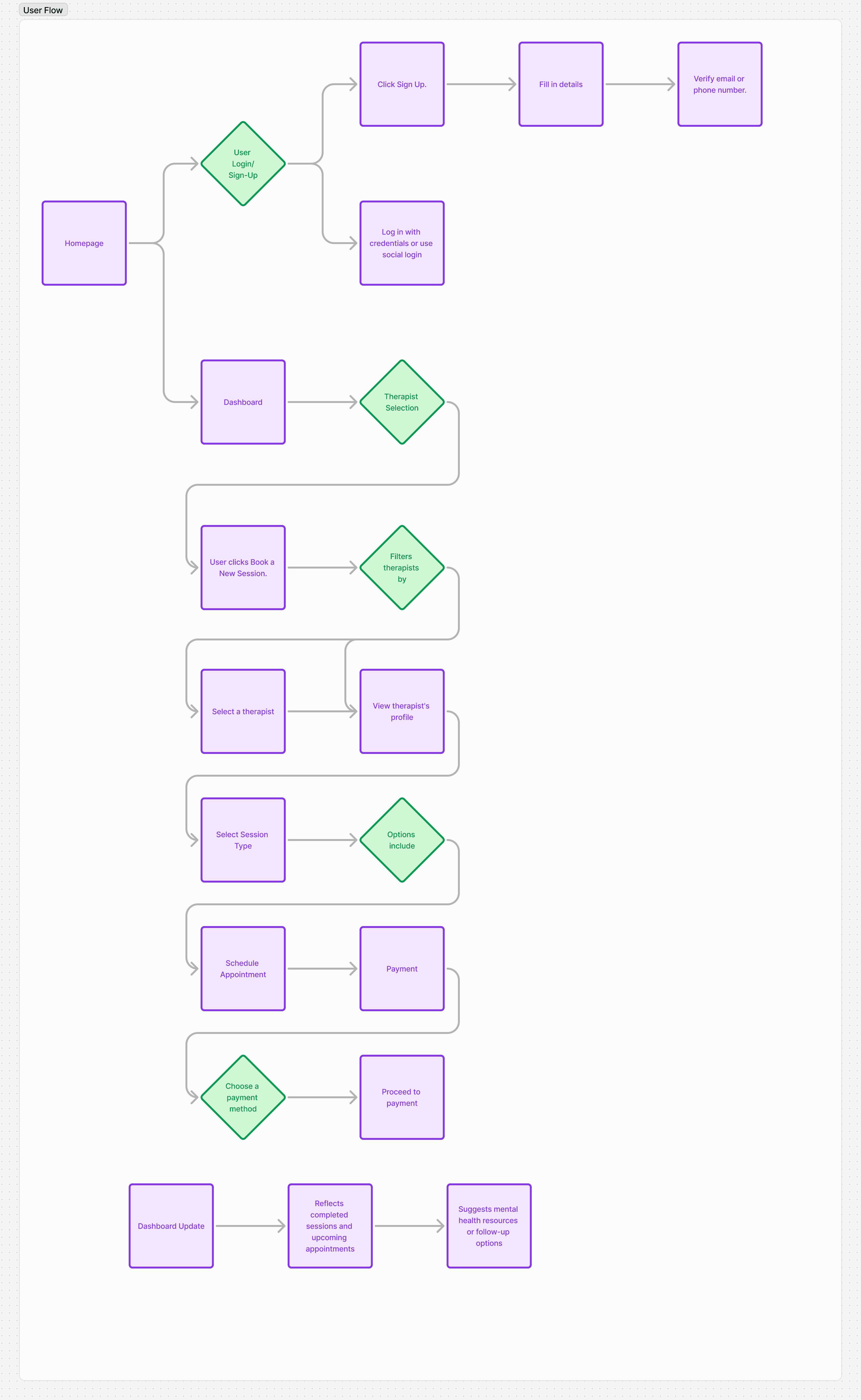
By organizing information intuitively, we ensured that users spend less time figuring out the app and more time focusing on their well-being.
Understanding the problem was only the first step. The next was structuring the solution.
Information Architecture:
Designed a logical, straightforward hierarchy for both user and therapist interactions.
User flow highlights: Easy account creation, clear therapist discovery, step-by-step booking.
Therapist flow highlights: Intuitive scheduling, appointment tracking, and earnings management.
User Flow Diagrams:
Customer Flow: Account creation → Browse therapists → View therapist profiles → Book appointment → Attend session → Provide feedback.
Doctor Flow: Sign-up → Create profile → Set availability → Accept bookings → Conduct sessions → Track performance.
By organizing information intuitively, we ensured that users spend less time figuring out the app and more time focusing on their well-being.
Define
Understanding the problem was only the first step. The next was structuring the solution.
Information Architecture:
Designed a logical, straightforward hierarchy for both user and therapist interactions.
User flow highlights: Easy account creation, clear therapist discovery, step-by-step booking.
Therapist flow highlights: Intuitive scheduling, appointment tracking, and earnings management.
User Flow Diagrams:
Customer Flow: Account creation → Browse therapists → View therapist profiles → Book appointment → Attend session → Provide feedback.
Doctor Flow: Sign-up → Create profile → Set availability → Accept bookings → Conduct sessions → Track performance.
By organizing information intuitively, we ensured that users spend less time figuring out the app and more time focusing on their well-being.
Iteration Design
Iteration Design
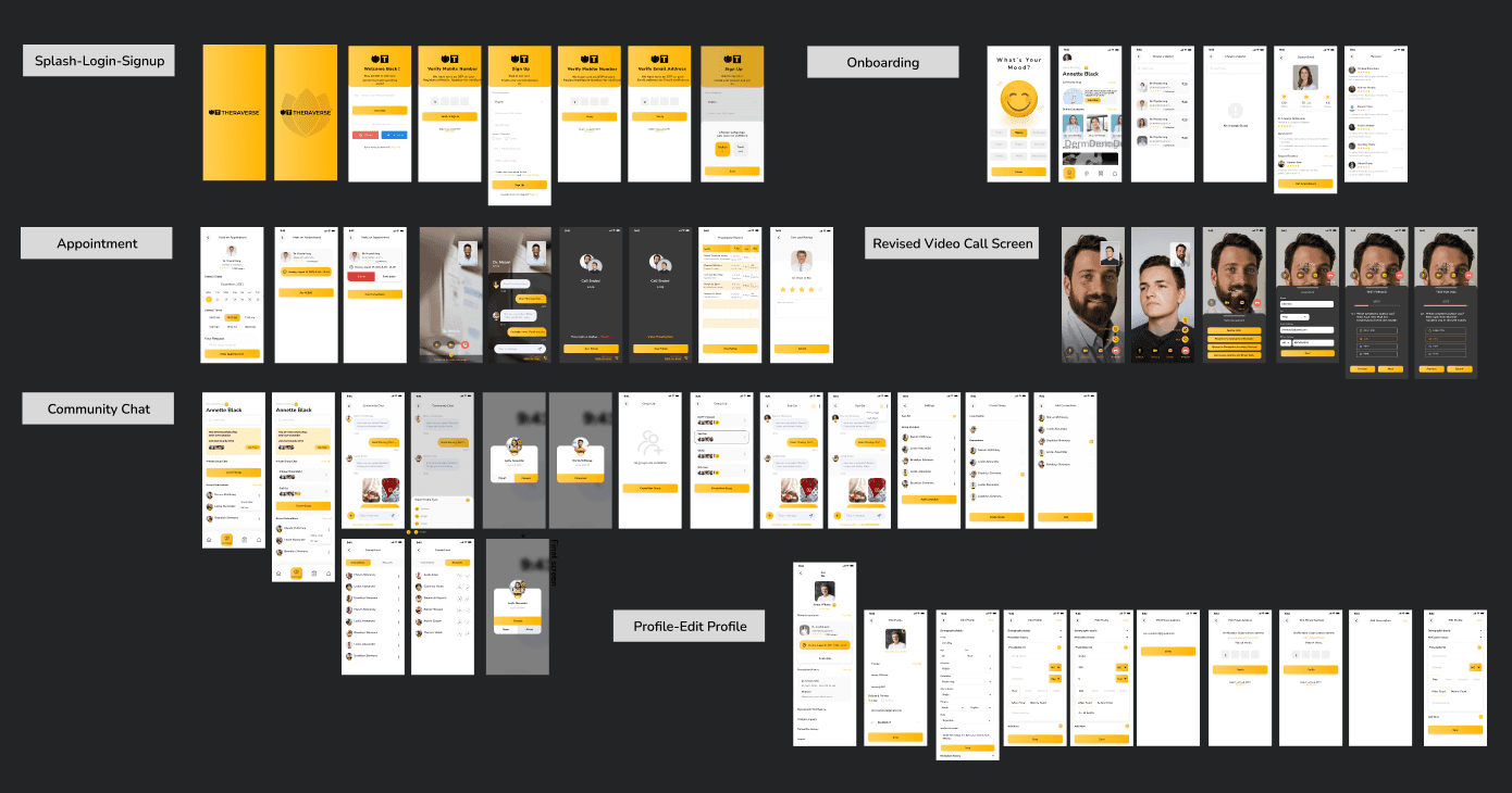
UI Screens
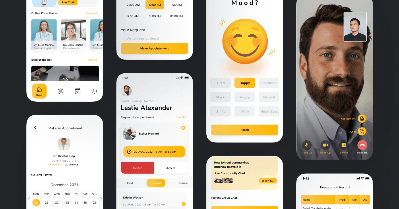
The Iteration Design phase revolved around crafting user-centric interfaces that resolved critical pain points while ensuring an intuitive experience for both users and therapists. The design process spanned from low-fidelity wireframes to polished high-fidelity mockups.
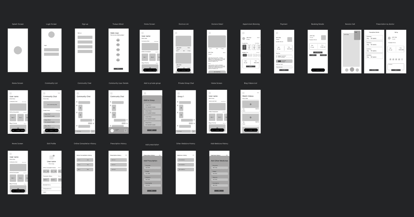
Low-Fidelity Designs
The design process began with low-fidelity wireframes to map out the application's structure and functionality. These wireframes provided a visual blueprint for key features, including:
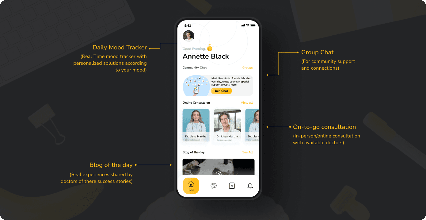
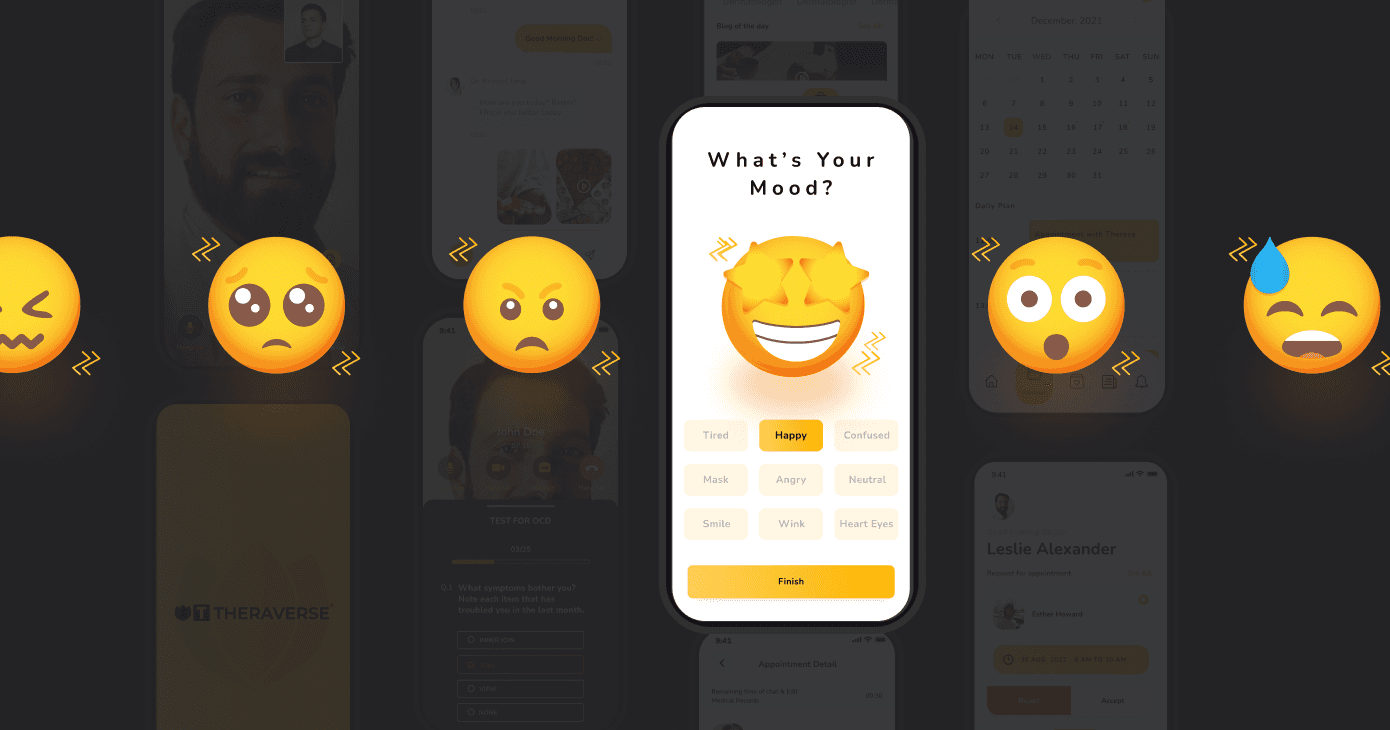
Home Screen: Conceptualized to be calm and inviting, focusing on reducing user anxiety and creating a positive first impression.
Booking Flow: Designed as a simple, step-by-step process to ease the complexity of appointment scheduling for users.
Session Screen: Included a secure video call interface, addressing user concerns about confidentiality and trust.
Therapist Dashboard: Structured for therapists to effortlessly manage schedules, earnings, and client feedback, ensuring smooth operations.
These wireframes helped identify areas of improvement through feedback, directly addressing user pain points such as difficulty navigating therapy options and booking appointments.
Pain Point Resolutions
Key pain points identified during the research phase were addressed through the following design choices:
Stigma and Anxiety: A clean and minimalistic interface reduced visual clutter, making therapy approachable for first-time users.
Navigation Complexity: Clear menus and structured layouts enhanced usability and accessibility across the platform.
Personalized Blogs: Highlighted case studies of there successful clients
Therapist Management: An intuitive dashboard streamlined appointment management and enabled better client engagement.
The iterative process improved user experience significantly, as demonstrated in before-and-after designs:
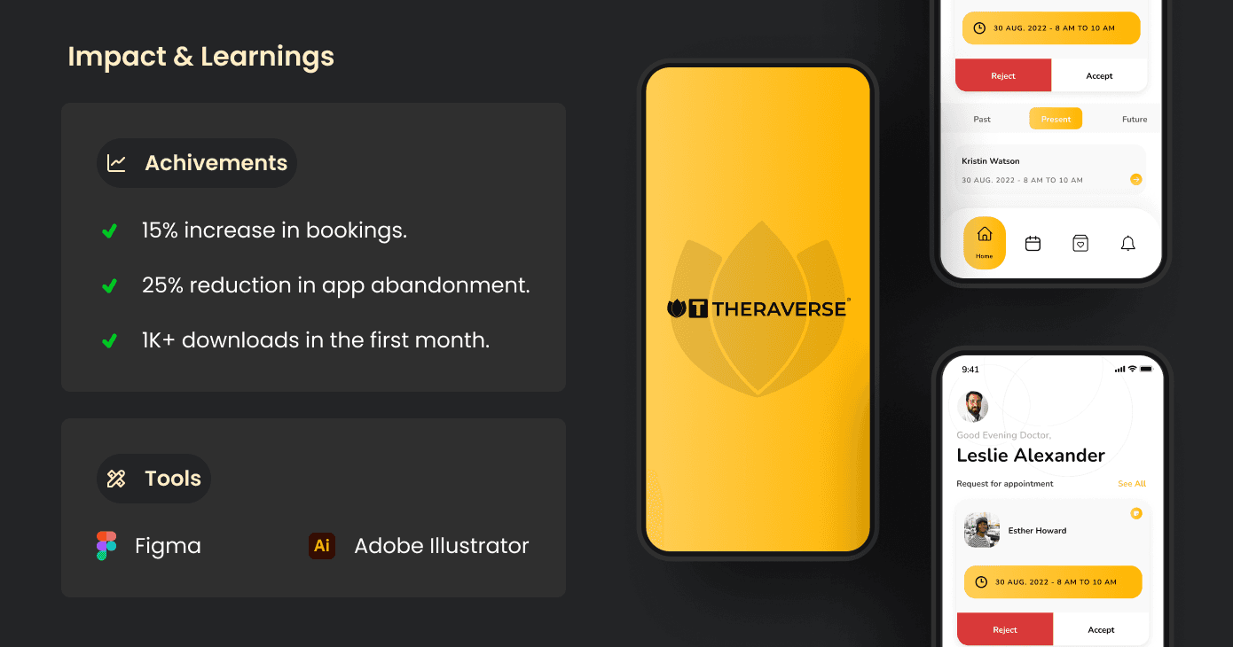
The Booking Flow was refined from a 5-step to a 3-step process, cutting down booking time by 40%.
The Home Screen now includes prominent quick-access features, catering to users seeking urgent support, improving engagement by 30%.
UI Screens
The Iteration Design phase revolved around crafting user-centric interfaces that resolved critical pain points while ensuring an intuitive experience for both users and therapists. The design process spanned from low-fidelity wireframes to polished high-fidelity mockups.
Low-Fidelity Designs
The design process began with low-fidelity wireframes to map out the application's structure and functionality. These wireframes provided a visual blueprint for key features, including:
Home Screen: Conceptualized to be calm and inviting, focusing on reducing user anxiety and creating a positive first impression.
Booking Flow: Designed as a simple, step-by-step process to ease the complexity of appointment scheduling for users.
Session Screen: Included a secure video call interface, addressing user concerns about confidentiality and trust.
Therapist Dashboard: Structured for therapists to effortlessly manage schedules, earnings, and client feedback, ensuring smooth operations.
These wireframes helped identify areas of improvement through feedback, directly addressing user pain points such as difficulty navigating therapy options and booking appointments.
Pain Point Resolutions
Key pain points identified during the research phase were addressed through the following design choices:
Stigma and Anxiety: A clean and minimalistic interface reduced visual clutter, making therapy approachable for first-time users.
Navigation Complexity: Clear menus and structured layouts enhanced usability and accessibility across the platform.
Personalized Blogs: Highlighted case studies of there successful clients
Therapist Management: An intuitive dashboard streamlined appointment management and enabled better client engagement.
The iterative process improved user experience significantly, as demonstrated in before-and-after designs:
The Booking Flow was refined from a 5-step to a 3-step process, cutting down booking time by 40%.
The Home Screen now includes prominent quick-access features, catering to users seeking urgent support, improving engagement by 30%.
Iteration Design
UI Screens
The Iteration Design phase revolved around crafting user-centric interfaces that resolved critical pain points while ensuring an intuitive experience for both users and therapists. The design process spanned from low-fidelity wireframes to polished high-fidelity mockups.
Low-Fidelity Designs
The design process began with low-fidelity wireframes to map out the application's structure and functionality. These wireframes provided a visual blueprint for key features, including:
Home Screen: Conceptualized to be calm and inviting, focusing on reducing user anxiety and creating a positive first impression.
Booking Flow: Designed as a simple, step-by-step process to ease the complexity of appointment scheduling for users.
Session Screen: Included a secure video call interface, addressing user concerns about confidentiality and trust.
Therapist Dashboard: Structured for therapists to effortlessly manage schedules, earnings, and client feedback, ensuring smooth operations.
These wireframes helped identify areas of improvement through feedback, directly addressing user pain points such as difficulty navigating therapy options and booking appointments.
Pain Point Resolutions
Key pain points identified during the research phase were addressed through the following design choices:
Stigma and Anxiety: A clean and minimalistic interface reduced visual clutter, making therapy approachable for first-time users.
Navigation Complexity: Clear menus and structured layouts enhanced usability and accessibility across the platform.
Personalized Blogs: Highlighted case studies of there successful clients
Therapist Management: An intuitive dashboard streamlined appointment management and enabled better client engagement.
The iterative process improved user experience significantly, as demonstrated in before-and-after designs:
The Booking Flow was refined from a 5-step to a 3-step process, cutting down booking time by 40%.
The Home Screen now includes prominent quick-access features, catering to users seeking urgent support, improving engagement by 30%.
More Works More Works
More Works More Works

©2024 JATIN DOLANI
GO BACK TO TOP
©2024 JATIN DOLANI
GO BACK TO TOP